Developing Game 2
by Shannon Shih and Elena Ariza
May 11, 2016
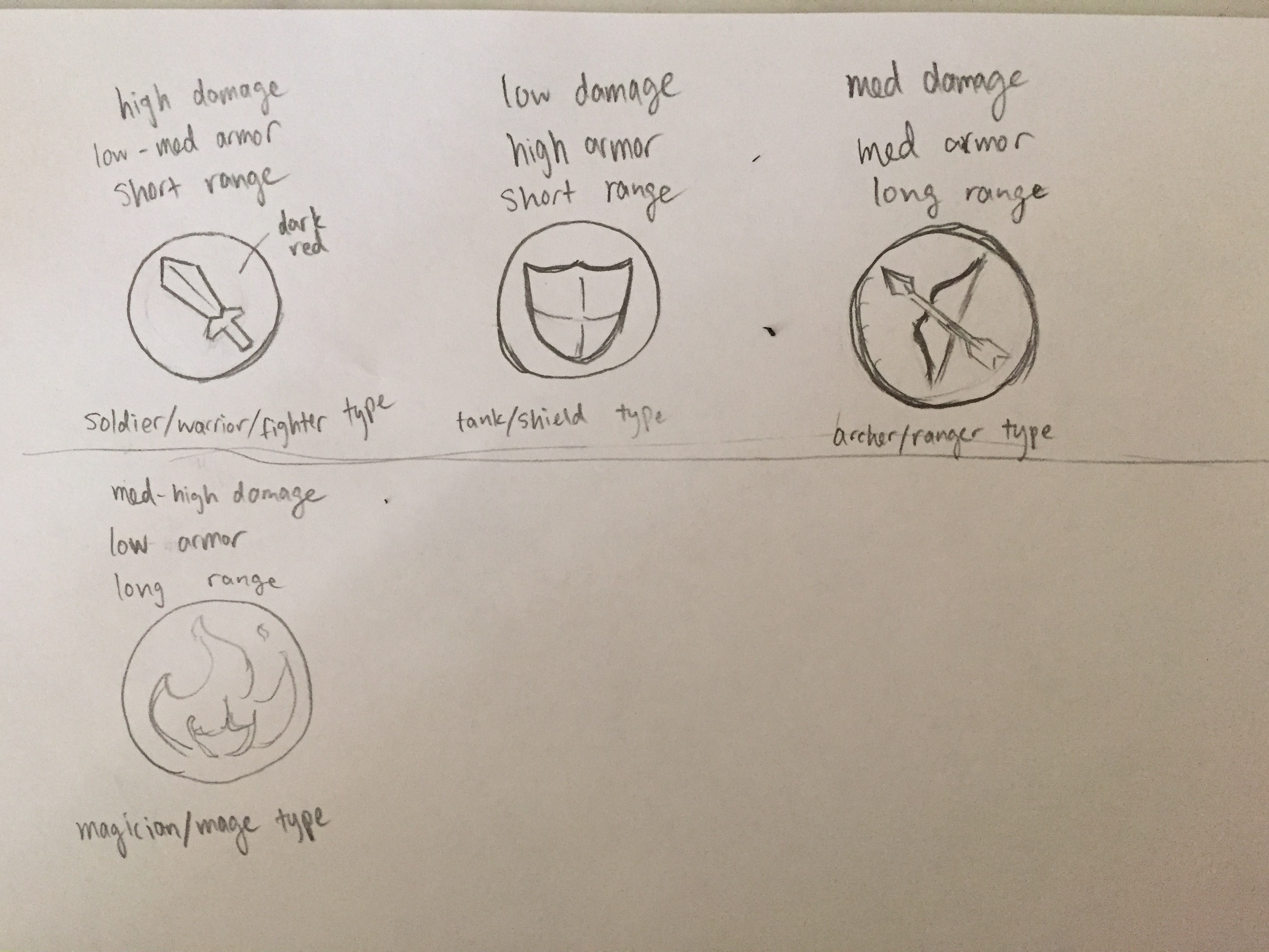
We worked on developing a new game today. So far, we've come up with the following rules:
- each player has different types of pieces that have different behaviors, health, and attack range
- the pieces move on a grid
- when a piece moves onto a cell on the grid, the cell changes color to mark it as the territory of the player that owns the piece
- there may be obstacles where neither side can move on to
- the goal is to capture as much territory as possible
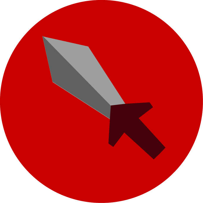
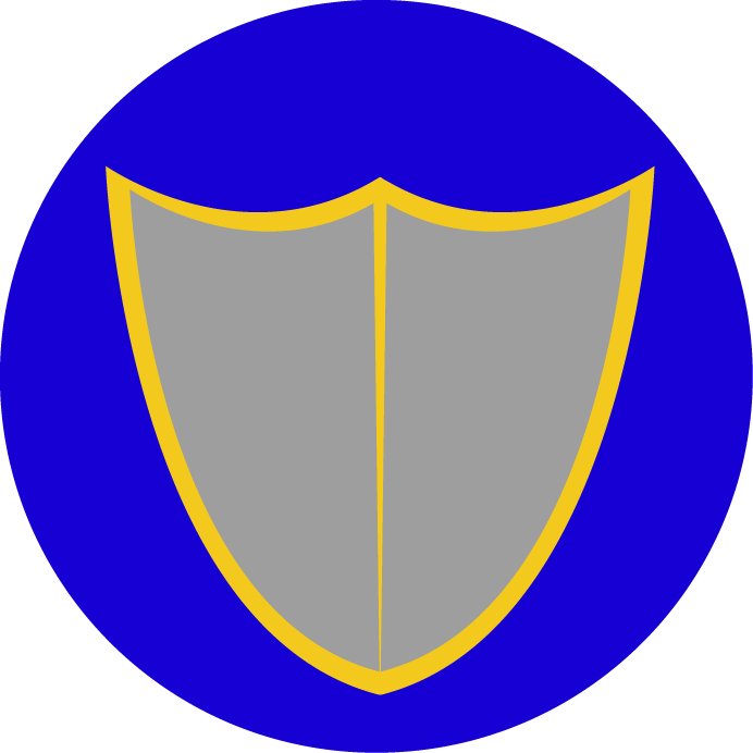
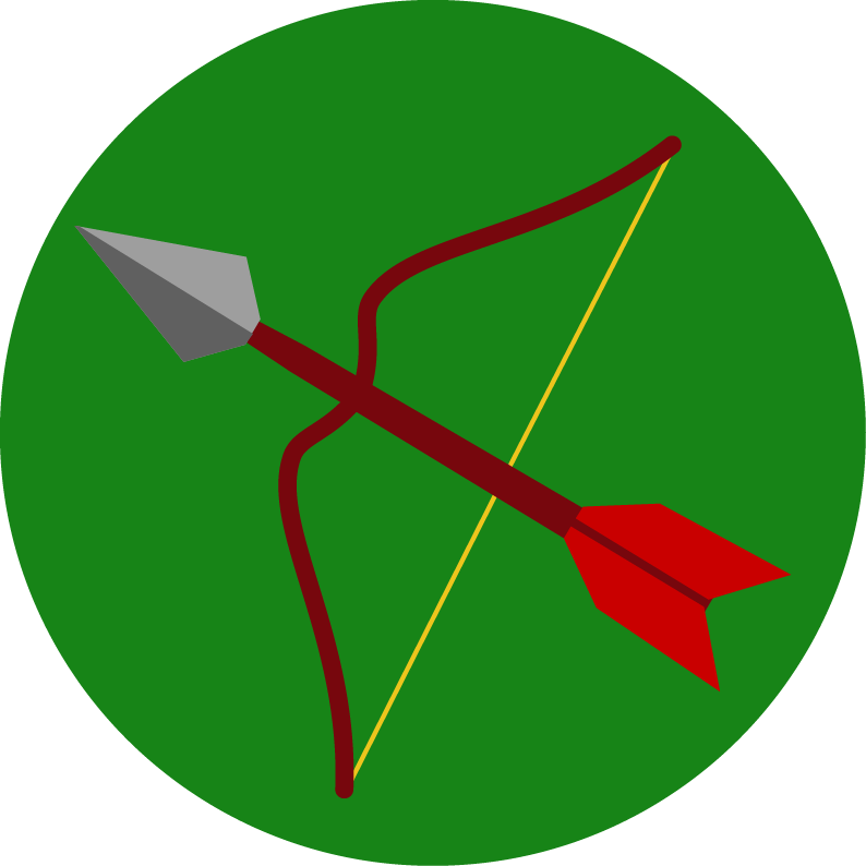
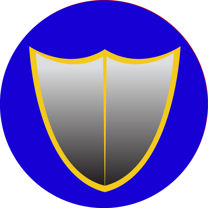
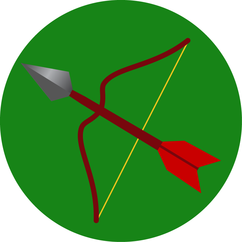
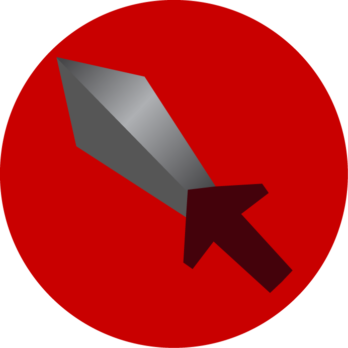
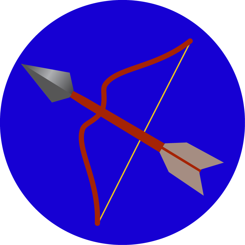
We also sketched preliminary sprites for the different types of pieces, then rendered them as vector art in Illustrator:

May 12, 2016
Although Elena had her AP stats test today, we managed to get some work done. We created a new github repository for our second game. Because it also uses a grid system, we decided to copy over the version of our project on May 3, which was when we fixed the CPU utilization bug, which made the game less CPU intensive. So right now our new game (lovingly dubbed Game-2) simply displays a grid whose cells turn red and back to grey when tapped.
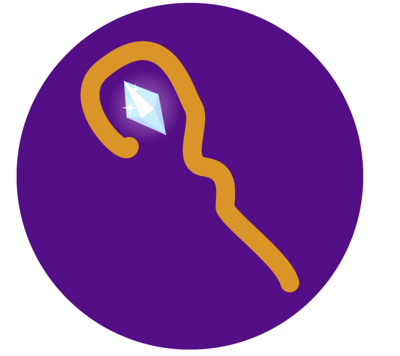
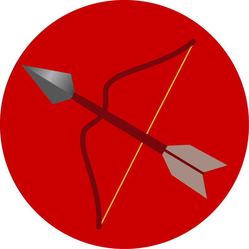
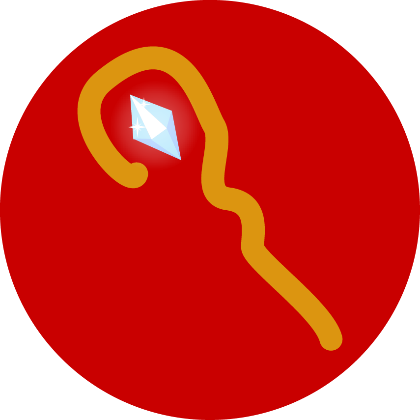
We also tweaked the sprites a bit. It took a surprisingly large amount of revisions before both of us were satisfied with the sprites, although the sprites are probably going to evolve further as we progress with our project. We mostly added gradients to the sword, shield, and arrowhead to give them a 3D look and tweaked the purple color of the mage sprite, but even those changes took a lot of revision because neither of us knew what we were looking for. We eventually settled on this graphic for our source of inspiration and modeled our gradients on it:


May 13, 2016
We're still working out the precise mechanics of Game 2, but we also worked on implementing the ideas we were pretty sure about and edited the graphics some more. For example, we implemented the different types of pieces (warrior, mage, defender, ranger) and their behaviors (partially--we still haven't worked out how health points relate to defense and how many health points attacks should take).
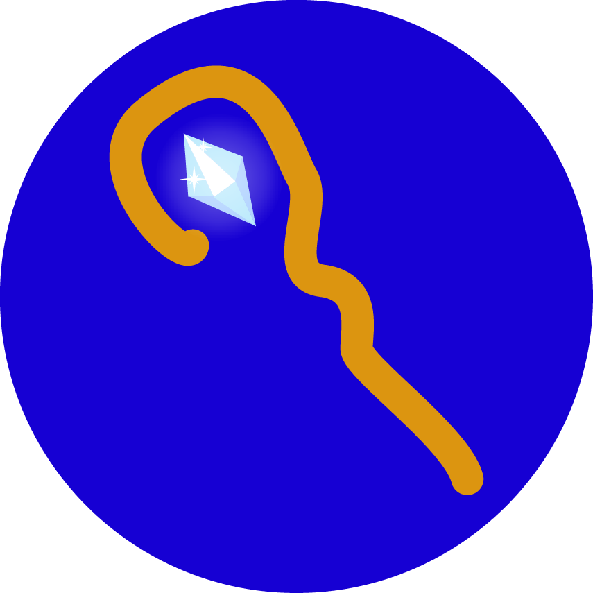
And here's a new version of the mage
May 16, 2016
From what we've planned so far, this game is probably going to involve a lot more graphics and animations than our last game. Because some of the graphics may be hard to make out if they're too small, we've implemented zooming in on the board to allow the users to get a tactical and strategic view of the game. Zooming also allows us to create a larger board without worrying about the graphics getting too small to see.
We also decided to remove the defense mechanic from our game, as having a defense mechanic would require us to calculate how much HP would be lost per attack, which complicates things. So we're simply having HP and attack--no defense. We're also adopting Hearthstone's mechanic of attacking at the same time to supplement Super Tribe's method of attacking, where the player can choose to have a piece attack the enemy's piece. When the piece attacks, the enemy piece attacks the attacker at the same time so that both sides deal damage and lose health at the same time. Each piece can also attack any piece within its movement range.
May 17, 2016
We've been a bit busy for the past few days between ASR, preparing for AP tests, and the AP Stats final project. However, we've continued discussing the mechanics of the game. A few more ideas we came up with:
- Healing would take 1 turn
- Mages would be able to heal and attack
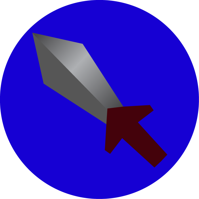
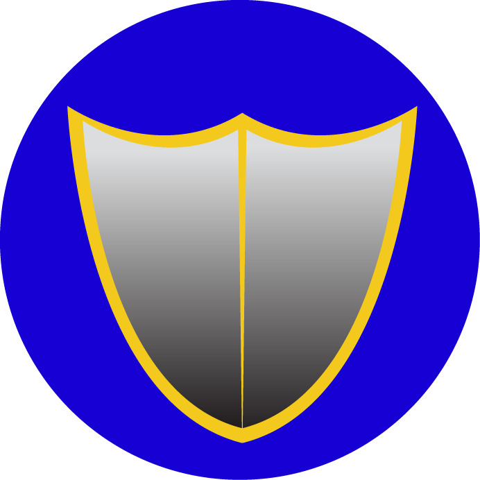
We've also converted the sprites to display the allegiance of the piece (red for player 1, blue for player 2):

May 18, 2016
We've started coding the behavior of each piece type. For the most part, each piece type only differs by its attack, range, health, and movement, although the mage has the additional ability to heal.
We also had a moment of panic when Elena thought her GitHub account got wiped because she couldn't see our repository. It took a while to sort out, but it turned out that she was logged into the wrong account (Dawnstar63 instead of Dawnstar64).
We've also started brainstorming ideas for the name of our second game. Here's some of the names we've come up so far:
- Dungeons and RPGs
- Dungeons and iPhones
- Dungeons and SpriteKit
- War of Strategy
- War of Strategies
- War tactics
- Battlefield
- Dungeons and Strategies
- Grid of Stones
- Field of Stones
- Field of Jewels
- Field of Fire
- Field of Steel
- Battle of Strategies
- Battlefield of Strategies
- Strategy Duel
- Duel of Strategies
- Rivals
- Rivalry
Top candidates:
- Strategy Duel
- Conquest
- Rivals
- Dungeons and Strategies
May 19, 2016
Today we had a meeting with our supervisor. Here's what we plan to get done by next meeting:
- make units appear on the board
- be able to place units on the board
- select cells on grid
- improve graphics
We also continued working out the mechanics (and some of the appearance) of the game, in a lot more detail:
- the goal of the game is destroy the enemy's city, which has health like any other unit OR surround the city completely with your units.
- the city of each player is located on the top and bottom middle of the board
- a unit can capture territory just by being near it (say, a radius of 2 squares around the unit)
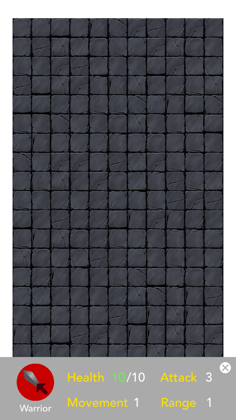
- to see the statistics (i.e., health, attack, range, movement, etc.) of a unit, the user can tap on a unit and the information will show up in a footer at the bottom
Training
- new units are spawned from a city
- the number of units that can be trained at the same time (called the training queue) is dependent on the amount of territory the player has captured
| territory captured (%) | training queue size (units) |
|---|---|
| 0 | 1 |
| 5 | 2 |
| 20 | 3 |
| 45 | 4 |
| 80 | 5 |
- to train new units, the player must tap on the city. When the city is tapped, the training queue appears at the bottom of the screen, where the status of the unit would normally appear
- tapping on an empty training queue spot would bring up a popup window showing the available units the player can train
- more powerful units take more turns to finish training
- when a new unit has finished training, the player can select where in an 8 or 5(?) block area around the immediate vicinity of the city the new unit will appear
- if there are no empty spaces around the city, the unit cannot spawn and will continue occupying a space in the training queue
- if the city is completely surrounded by enemy units, the surrounded city's player loses.
May 20, 2016
Today we didn't get much done because Life Beyond Menlo took up most of the day. However, we continued working on zoom control for the board and the status bar for detailed view of selected pieces and cities.
May 23, 2016
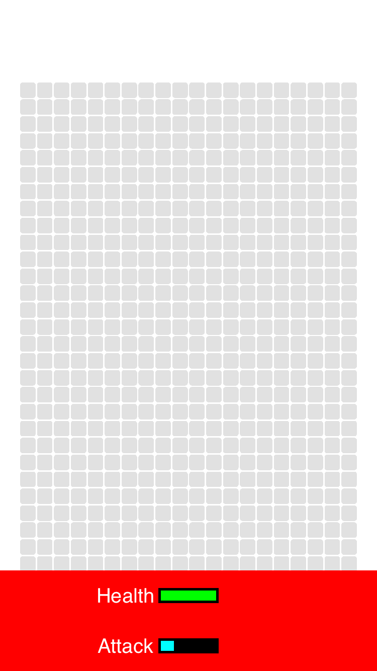
We've made a lot of progress in perfecting the Status Bar and zoom function. The zoom no longer goes outside of bounds when the user zooms in, moves to the edge of the screen, and zooms out. Instead, the board moves so that it's corner aligns with the corner of the screen so that it doesn't go out of bounds. For the Status Bar, we managed to display health bars displaying how much health and attack the selected piece has. It was hard getting the rectangle representing the current health (green) centered in the health bar (black border), but after a lot of fiddling around with anchor points and positioning, we managed to align the left edges of the current health bar and the health bar so that the health bar would increase from left to right.
May 24, 2016
We worked a lot on the board background and status bar today.
Background
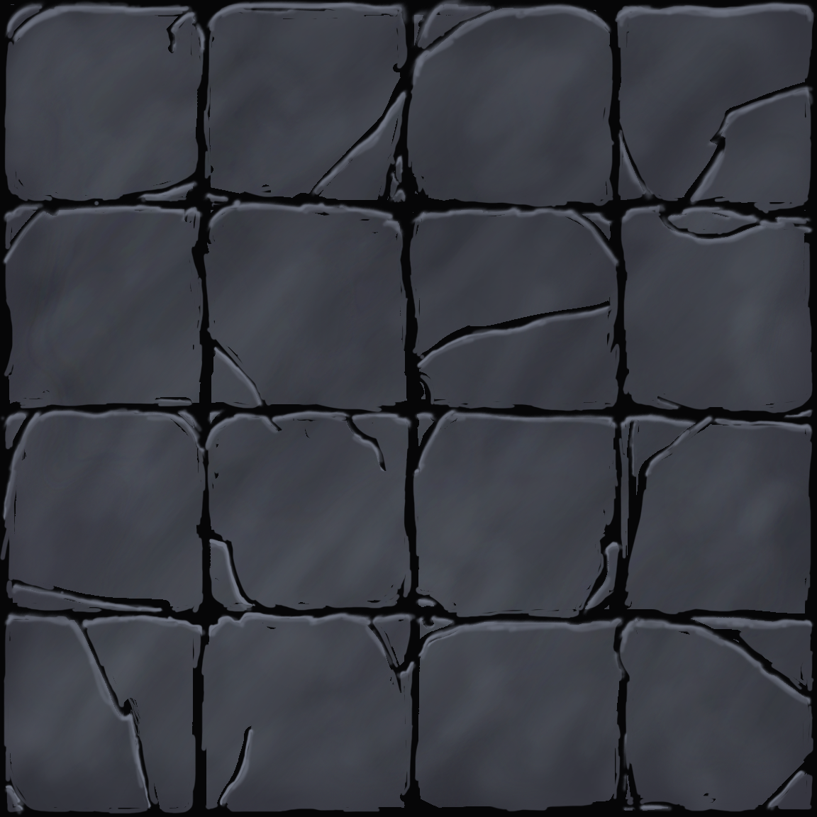
We decided to make the board cells look like stones, which we painted using Photoshop:
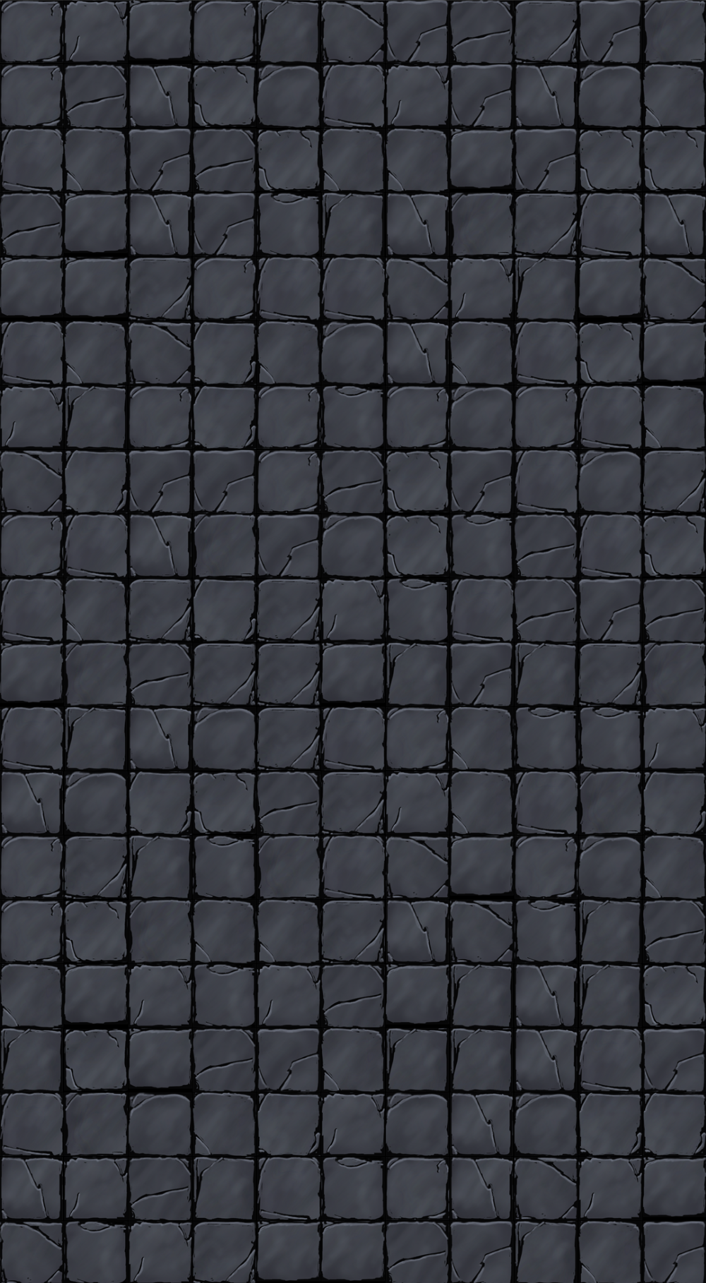
To create an entire board out of the stones, we cut up the image above and used a programming language called Processing to randomly distribute the 16 tiles across a grid of the desired resolution. We originally were also going to rotate the tiles, but eventually decided that the grains running across the tiles looked better when they all weren't rotated (otherwise the grains wouldn't be parallel):
Once the image was imported to Xcode, we aligned the gray cells we originally had to the imported image to ensure that the cell that the user tapped on the image would correspond to the right cell as interpreted by the program. Because the imported image was hand drawn, it was difficult to perfectly align the cells. Although the offset between the cells in the background image and the cells drawn by the app was difficult to see at first, the amount of offset was exaggerated when zoomed in. Thus, it was important that we make sure that the two were aligned well. We ended up having to add slightly less space between cells at the bottom versus cells at the top.
Status Bar
After some debate, we decided to display the stats of a selected piece as numbers rather than horizontal bars because displaying them as horizontal bars would require us to establish a "maximum" reference number for the horizontal bars to compare to, which limited our options and would make the status bar look confusing. Thus, the stats would be displayed simply as numbers (with the exception of the health stat, which would be displayed as: current health/max health).
We also changed up some of the colors of the status bar and added a cancel (x) button on the top right corner for the user to close the status bar as well as the ability to display the sprite of the selected piece. Aligning the stats in the status bar was annoying because it required us to continuously tweak the x and y coordinates of the stats, which were calculated based on the screen size.
Miscellaneous
We also edited the shadows for the mage sprite slightly with a tool called the Mesh Tool in Illustrator. The Mesh Tool was unexpectedly hard to work with because it drew a gradient relative to the four corners of a rectangle. When the rectangle was stretched to fit the shape of the cane, the gradient that was drawn in the rectangle didn't quite follow the shape of the cane, leading to some inconsistent shadows (i.e., a darker top of cane than the bottom of the cane) that required us to shuffle around the points that made up the rectangle-now-turned-cane gradient mesh.
Because a lot of our work was being done in GameScene, we decided to split up the contents of GameScene into several files so that we could work on the project at the same time without any Github conflicts (conflicts happen when we edit the same file at the same time). It's now a lot easier to work without fear of conflicts now that there is a "Status Bar" file and a "zoom control" file that we can work on independently.
We also added the capability to add Pieces to the board. After we aligned the programmatically drawn cells with the background image that we imported, we made the programmatically drawn cells invisible, then replaced the invisible cells with sprites of the Pieces when tapped by the user. At the moment, the Pieces don't do anything, but they will soon.
^ Too many Warrior Pieces!!
May 25, 2016
We've started implementing the code for the base, including the base menu and behavior for when the user touches the base. We've also created the graphics for the base, again using Illustrator.
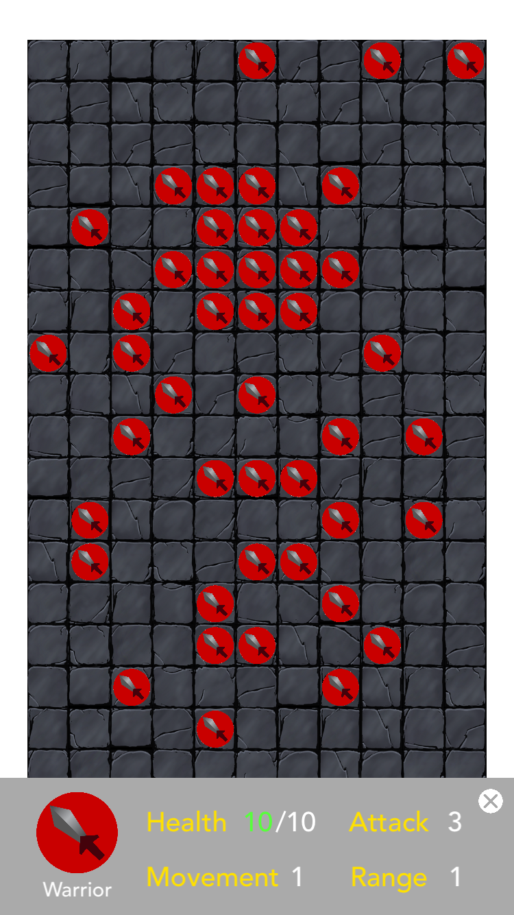
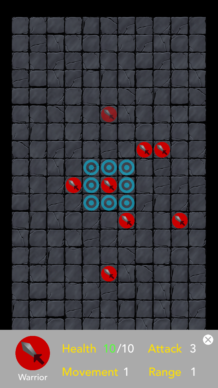
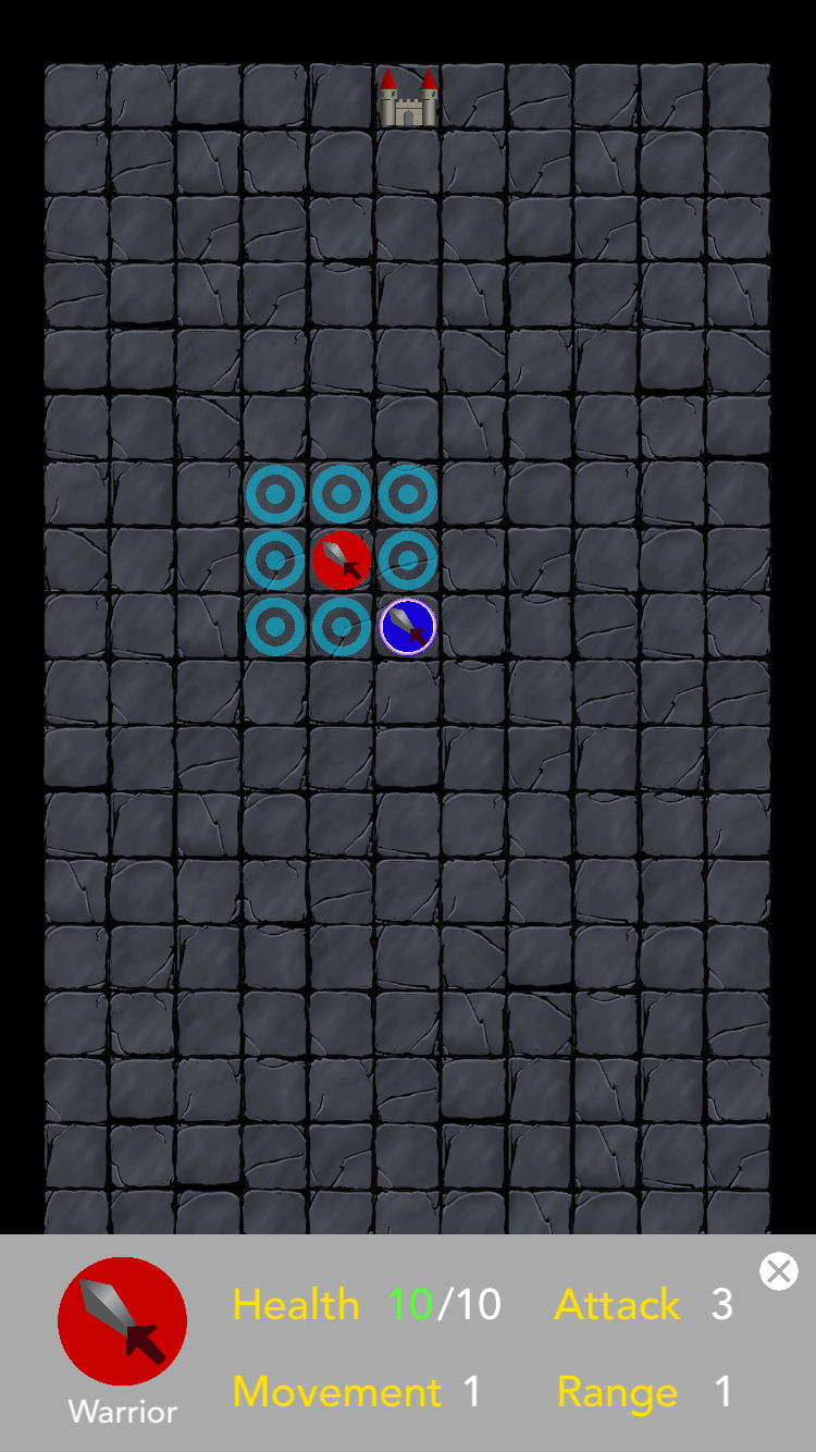
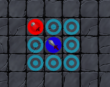
We also made blue targets appear around a piece when selected to indicate locations where the piece can move next. We initially ran into some trouble trying to get the targets to disappear after the piece was unselected, but storing the targets in an array fixed the problem. We also made the piece gray out once it was moved to indicate that it couldn't be interacted with anymore.
One issue is that once the status bar or base menu appears, the player can't see the bottom of the board because of the camera constraints. It should be fixed pretty easily with a few lines of code.
Showing a grayed out piece (topmost piece) and the status bar for a selected piece and its available moves (denoted by blue targets):
The base menu (bottom):
May 26, 2016
The base menu now appears when the user taps the location of the base menu. At the moment, the base menu doesn't show much--just some empty squares which will show the pieces that are currently in training in the future.
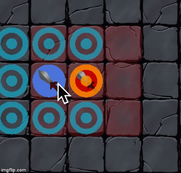
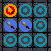
In addition to showing possible locations that a selected piece can move to, we also added possible pieces the selected piece can attack. However, our red targets are probably not going to show up when overlaid over a red piece, so we're still trying to work out a way to get around that problem, probably by recoloring the target.
Also, during our meeting, we laid out the goals that we wanted to accomplish by next week:
- finish implementing the game, including logic and graphics required to play the game (animations and fancy stuff optional)
May 27, 2016
For some reason, the Swift compiler is complaining about integer types not being compatible with the function I'm using even though there aren't even any Integers involved. It's preventing us from implementing attacks, so we spent a lot of time trying to work out that bug.
In the meantime, we also made the bases for each player show up on the board on startup and changed the indicator for pieces that are available to attack to a glowing ring. The indicator isn't as clear as we'd hoped, so we're going to continue testing out other graphics.
May 31, 2016
So over the 3-day weekend we worked on a lot of aspects of our game:
Controlling pieces
A lot of what we did with pieces was clean up bugs around piece selection, attacking, and movement, such as preventing users from moving and controlling opposing players' pieces.
It also turns out that the bug that prevented us from allowing pieces to attack each other was because of a name conflict; there was an Int variable named attack and a function named attack, so when we tried to call the function attack() the compiler thought we were trying to get the variable named attack. Simply changing the name of the function to attackPiece fixed the bug.
We also managed to create cool attacking animations! It took a lot of code and experimentation, but we think it's pretty neat:
Mage pieces can also heal other pieces around them now.
Territories
We finally got around to implementing territories, which will determine how many training spots each player has (see Training under the May 19, 2016 entry). As each piece moves, it turns all the adjacent squares around it into its player's territory. To denote this, we gave the cells a red or blue hue.
Piece Status Bar
The status bars that show the stats of the selected piece now update whenever the piece is attacked/attacking another piece.
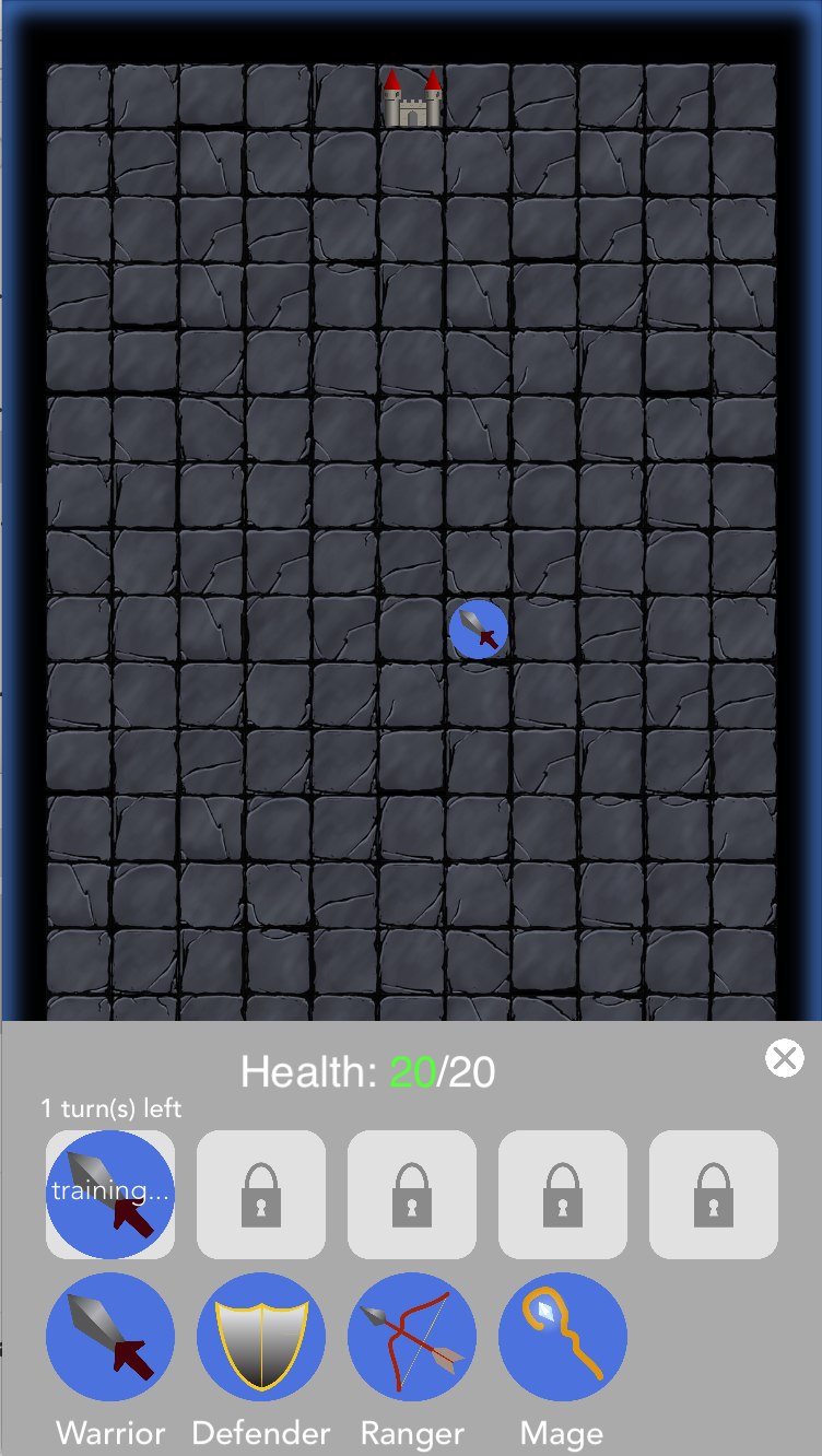
Bases
Bases now appear on the board at startup, and when tapped, a base menu showing the training queue and piece types pops up. We initially had tons of trouble getting the training queue to unlock based on the amount of territory each player has, but it turned out that the bug was hiding in one of our many if statement logic checks.
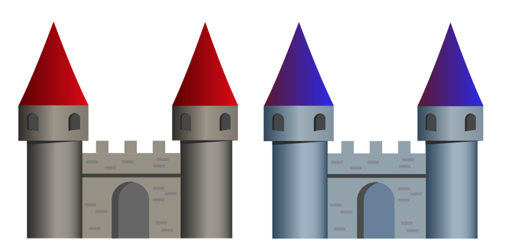
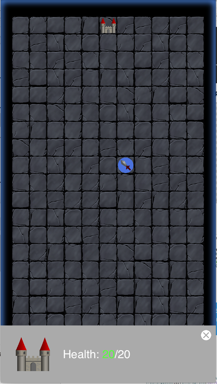
We also created another mini menu for viewing the opposing base's health. As outlined in our May 19 post, the goal of the game is to surround or destroy the enemy's base. Thus, it was important to show the health of the bases.
Viewing player's base:
Viewing enemy's base:
Code Organization
Over the last few weeks, the tapped() function of our GameScene had grown to gargantuan proportions, mostly comprising of a giant if/else if statement that handled all the tapping that the user did. The messiness made the code hard to read and may have been the source of some of the various bugs we had, so we rewrote the entire if/else statement using pseudocode, then translated it into Swift again. While the function is still very long, organizing the code helped us debug any further problems that cropped up.
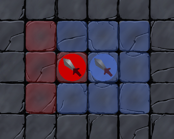
Miscellaneous Blue pieces are now lighter because they don't show up very well against the dark background. And instead of making a glow around the piece the attack indicator, we changed the target that represented the attack indicator from red to yellow-orange. Since none of the pieces' colors are close to yellow-orange, it shows up nicely when drawn on top of other pieces
Before:
After:
Also, when a menu is drawn onto the screen, it would block out part of the board. Now, we've fixed the camera controller so that the user can drag the board further upwards when a menu is drawn on screen so that the user can see the bottom of the board that was originally being covered by the menu.
We can now switch players by tapping a nextRoundButton (which appears as a translucent square on the bottom corner of the screen right now). We'll get around to actually designing a proper graphic for the button soon (hopefully).
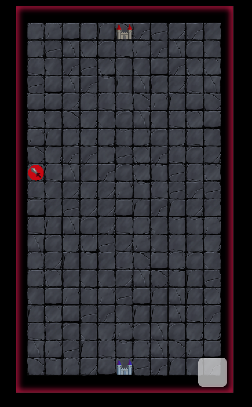
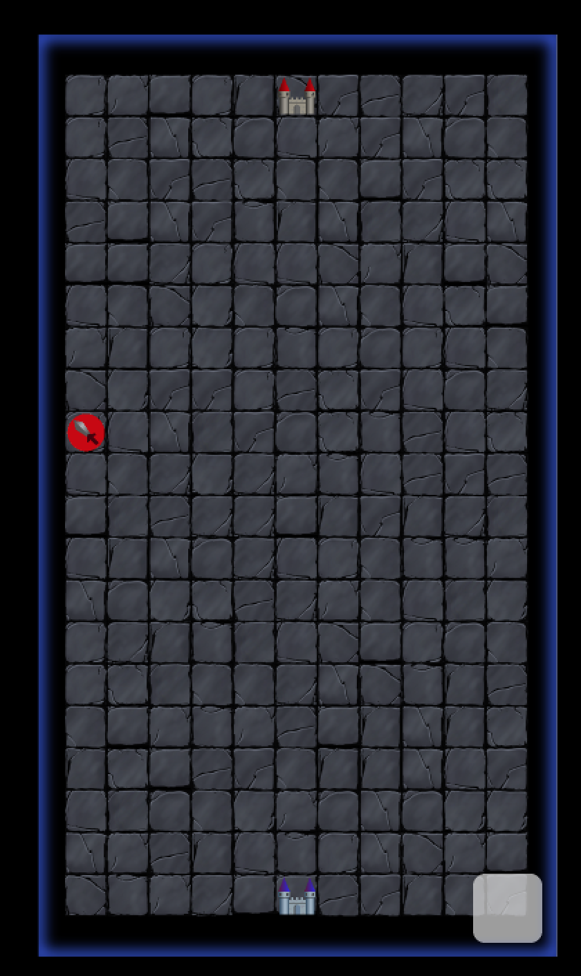
Since there was no obvious way to tell whose turn it was, we decided to add a glow around the screen.
June 1, 2016
Today was mostly centered around fixing persistent bugs in our games and preparing for our presentation on Friday. We made sure the training queue worked properly, made moving pieces easier for the players, and made a game over screen. We also play tested the game and noticed other things we could improve with, such as making the board smaller and making some pieces less powerful.
After running through our presentation a few times, we also created a demo script that would display the game in the middle rather than at the beginning so demonstration would go more smoothly and created a script that detailed exactly what we would say to complement our Google slides presentation.